Earlier this week, we announced our up-coming 12 Days of Christmas Mitten Garland Knit Along which is starting in June. Between now and then, I will be writing a series of posts on different topics to prepare you for the KAL. Right now everyone is thinking about what colors they are going to do their mittens and getting their yarn together, so I thought color would be a good first topic.
Before we start talking about different palette choices, I do want to give you my two basic pieces of advice.
- Make sure the colors you chose for any one mitten have enough contrast. These are designed so that you want the image to stand out against the background.
- Stay away from yarns with lots of quick, drastic color changes like hand painted yarns, the color changes had a tendency to make the design muddy. Though softer color variations, like heathers, can be beautiful.
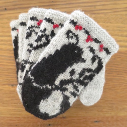
I wanted my set to all be the same colors and have strong contrast between the design and background. I went with a light grey and black with a pop of red for the berries. It is a look that goes real well with my Scandinavian, mid-century decor.
But that doesn’t mean you can’t go a completely different direction. Let’s take a look at some of the color palettes used in last year’s Mitten Garland Advent Calendar to get some ideas.
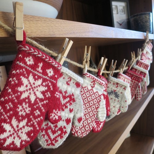
I kept all my mittens the same last year, but my red the more prominent color. You could use red where I used the black on this year’s mittens for a really striking effect.
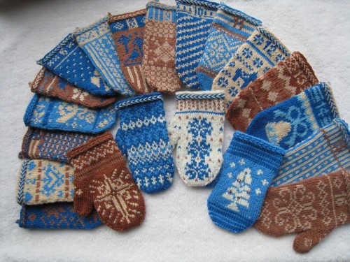
Grannie also stuck to the same palette for all her mittens, but went with blues, browns and creams. This is a very striking look for the holidays.
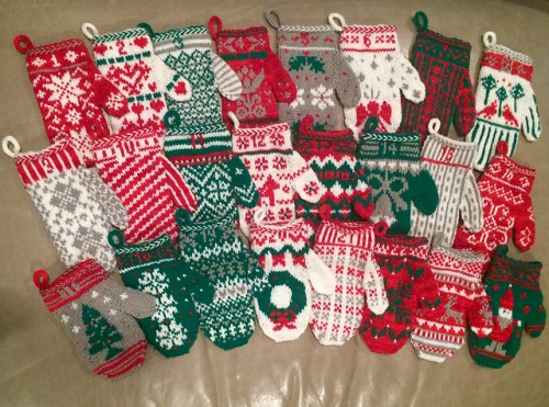
Toast543 went with a very traditional Christmas palette, but used Knit Picks Stroll Glimmer, a yarn with a metallic sheen to it, for the white and grey. I think using a touch of metallic in these is brilliant. I’m tempted to go back and do 5 Golden Rings with gold.
Then there are the set that just had fun with color.
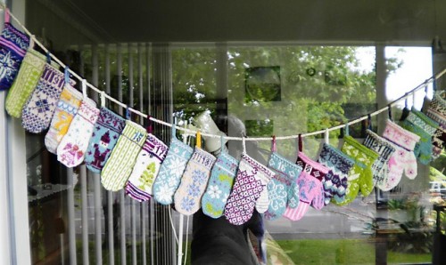
Kiwiquilter had fun using her stash throwing in all sorts of colors, plus metallics and beads. Using the colors in different ways throughout the whole set makes it hold together.
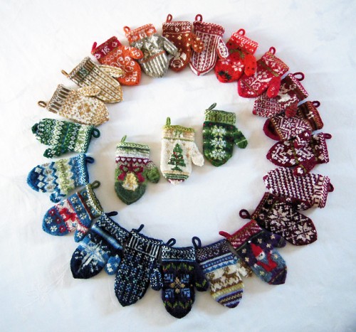
Lacesockslupins use the whole rainbow of colors for her mittens. The way the colors move through the whole set works beautifully.
So whether you decide to make all your mittens match or play with all the colors, you can really get a striking look. It is all about your style! With this set, the design at the cuff and style of the mittens will also help hold it together.
Finally, let’s talk about peek through. I know I am suggesting strong contrast in your mittens, but you also want to be careful that your darker color doesn’t show through too much. Here is what I mean. I was originally planning to do my mittens in either cream or white with back, but when I knit it up in cream I was really unhappy with how the black showed through the cream.
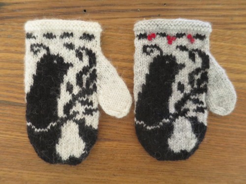
You can really see it here on the thumb, especially when looking at where the black is stranded behind and where it isn’t.
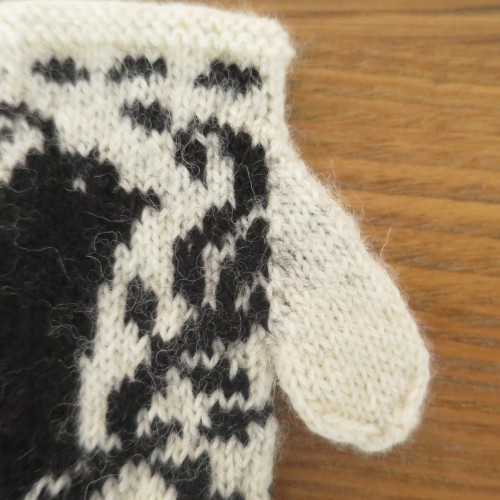
It isn’t AWFUL, but it was enough to bother me. It was even worse with the white. Blocking helped, but not enough for me. I still felt like the lighter color didn’t look clean and the design didn’t look as crisp. I found the heather grey stood up to the black behind it much better. The design of these mittens calls for some longer areas of stranded color and will require catching the yarn, so I would suggest doing a color work swatch of the colors you want to use and make sure you like how they knit up together.
© 2005 – 2016 Kathy Lewinski & Susan Cornish

