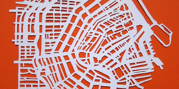
Our first challenge for the second year of Iron Craft was to make something with paper. I channeled my inner Dr. Russ and did a paper cut map of the city of Amsterdam.
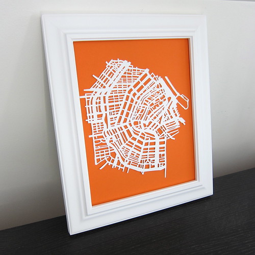
We recently had the bathrooms redone in our house. I was looking through Etsy for some art for the downstairs one and came across these amazing paper cut maps by Lekker Haas Paper. They look so complicated, but I figured Iron Craft is about challenging myself, so why not give it a go.
I decided to do a map of Amsterdam, because the other artwork I have planned for that room is a photo I took of Amsterdam canal houses. One of the hardest parts was finding a good city map to use. I needed something that was detailed without being overly detailed and didn’t cover up streets with writing and such.

After a lot of time on Google images I found this map which had a great graphic quality to start with.
Next, I had to figure out what I was going to cut out. The idea is to just leave the streets and, in the case of Amsterdam, the canals. I used a thin black marker and a ruler to emphasis the lines I was going to cut. Now I had a pattern I could use to create the paper cut.
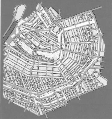
Then I scanned the map with all my markings into my computer. On the computer I flipped the map horizontally and printed it onto a piece of white cardstock. I flipped the map because it would be on the back on my finished piece, so if I wanted my map to face the right direction it had to be backwards.
Then it was just down to the cutting. I used an exacto knife and it took be about three evenings to get the whole thing finished. At first I was worried about my lines not being exactly straight and my corners not being crisp, but once I let go of that I really enjoyed the process. Since I was happy with how it was going I actually added more detailed smaller streets than I had originally planned.
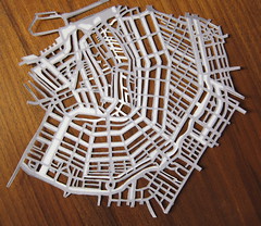

Here you can see the back of the cut out with a little of the map left and plain white front.
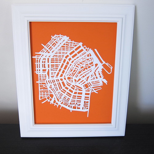
Once it was all cut out it was just a matter of mounting it to a piece of paper and framing. Spray adhesive really would be the best way mount one of these, but my can of it would not spray and I was under the gun to get finished. So, I just used a few dots of glue brushed on to hold it on. The glass in the frame (which isn’t here because it makes for awful photos) will hold the whole map flat to the backing.
Originally, I was going to put the map in a floating frame, one where there is glass in the front and back, which would let the wall color be the background color for the map. The bathroom is all black, white and grey, so I thought a pop of color would be better and orange goes so great with grey. I didn’t even think until it was all framed that orange is the color of Dutch national pride.
© 2005 – 2012 Kathy Lewinski & Susan Cornish



That’s so awesome!!!
Well done. Welcome to my compulsion. For a first piece, you certainly started off with something very intricate. I am glad that you took your time and that you feel rewarded with a wonderful piece. This really is stunning (and orange is my favorite color). Once again, congrats on a beautiful piece.
WOW
WoW I need that for my house!! My hubby is Dutch, my boys half, and I’m a quarter — and this would go with our own Amsterdam map/canal picture decor!! Would you consider making another for cash?!!? LOVE IT!
Very well done!
That is an awesome project! I scrapped my first project idea, because it really needed spray adhesive (which I don’t even have, how weird is that!?).
This turned out great.. the orange was the right color to go with. Nice job. Now for your finger to heal 🙂
You really did a great job. I’m so impressed!
It looks pretty darned perfect to me – well done!
thanks for sharing! I can’t wait to try it.
This is so beautiful. I love the orange and made the Dutch connection right away – it’s just wonderful! Thank you for the inspiration! I’d love to make one of these of Nairobi and, since my husband and I honeymooned in Amsterdam, perhaps I should try that as well (but, definitely something less intricate first).
If anyone is thinking of doing Boston, this map is pretty perfect!
http://www.lib.utexas.edu/maps/historical/boston_1842.jpg
Pingback: 五步教你把城市地图做成剪纸画
Pingback: DIY | Pearltrees
This is amazing! My boyfriend and I just spent 2 week sin Amsterdam a few months ago, and this would be a great gift for him for valentine’s day. Would it be possible for you to post to email me the scanned document you used? I am having trouble finding a good file to use. Thanks!
Pingback: A Labour of Love: for my Beloved. « WaywardChild's Blog
Pingback: papercut maps « having fun now too
Pingback: #19 Paper City | Dots.
Pingback: DIY Series: Paper Cut Map! « nest design studio { blog }
Pingback: Artwork | Pearltrees
Pingback: {Flash Friday 2} | The Little Red Horse
Pingback: Créa | Pearltrees
Pingback: Paper Cuts | ritewhileucan
Pingback: Tipousse | Pearltrees